Hindenburghaus Hamburg
Quest Investment Partners
A magnificent Kontorhaus building in the style of a luxury hotel
Behind the stately sandstone façade, this building surprises every visitor with its grand entrance hall that is well-known even beyond the borders of Hamburg: elaborate wood carvings, ornamented stucco ceilings, fine woods, decorative marble floors and huge chandeliers in Art Nouveau style create an almost cinematic atmosphere. One thing is certain: the Hindenburghaus, built in 1909 by the architects Hiller & Kuhlmann as a luxury hotel, was designed to impress. And it continues to do so. The First World War, however, put an abrupt end to its use as a hotel. Hanseatic merchants were quick to set up their offices in the building, turning it into a Kontorhaus gem. The refurbishment aims to let the unique character of this listed building shine in new splendour.
As part of the Nikolai Quartier, the Hindenburghaus building benefits from the upgrade of the Business Improvement District. The property enjoys a central location, situated within walking distance of the town hall, the stock exchange, various bus stops and the U– and S–Bahn stations Rödingsmarkt and Stadthausbrücke.
Façade Design Concept
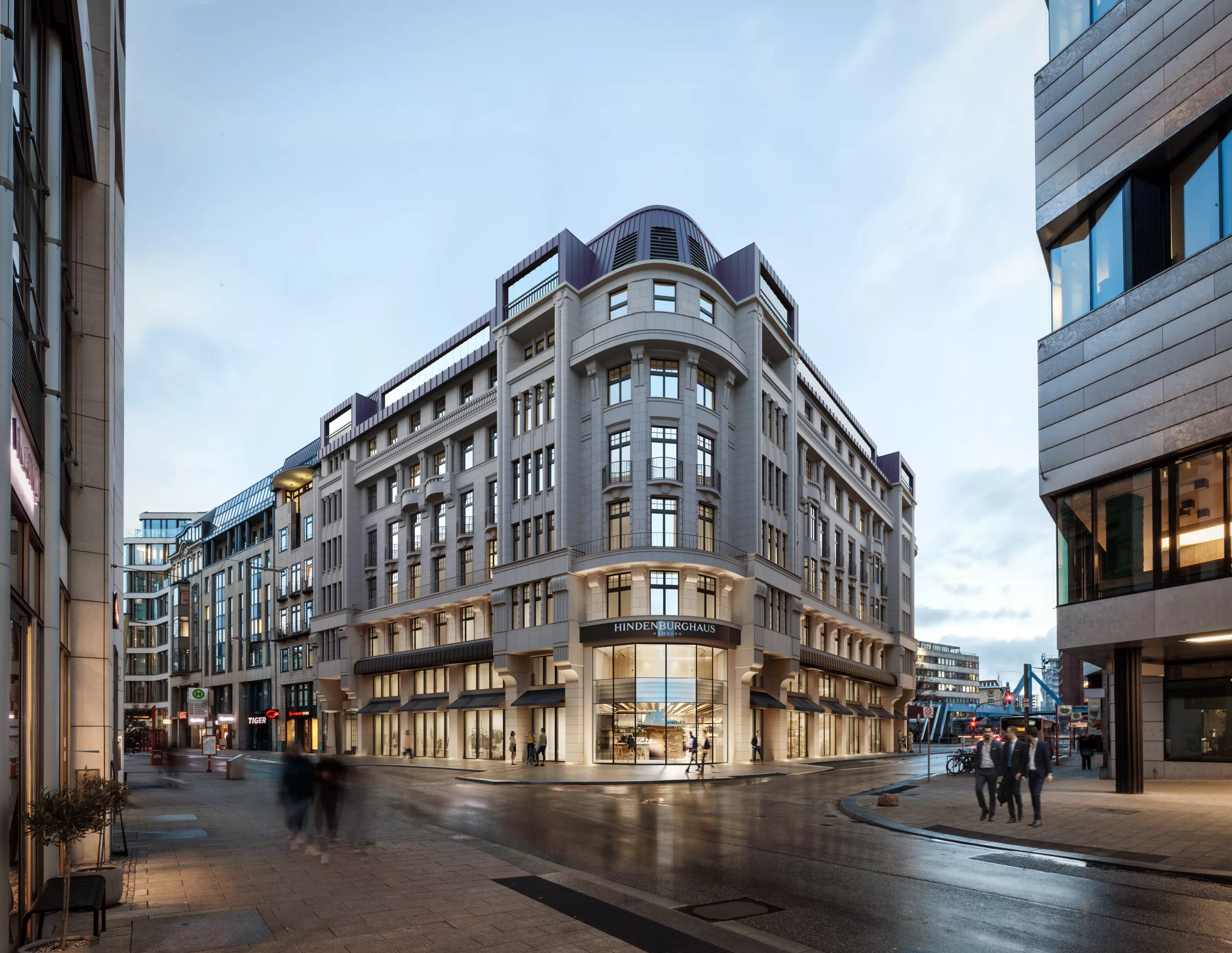
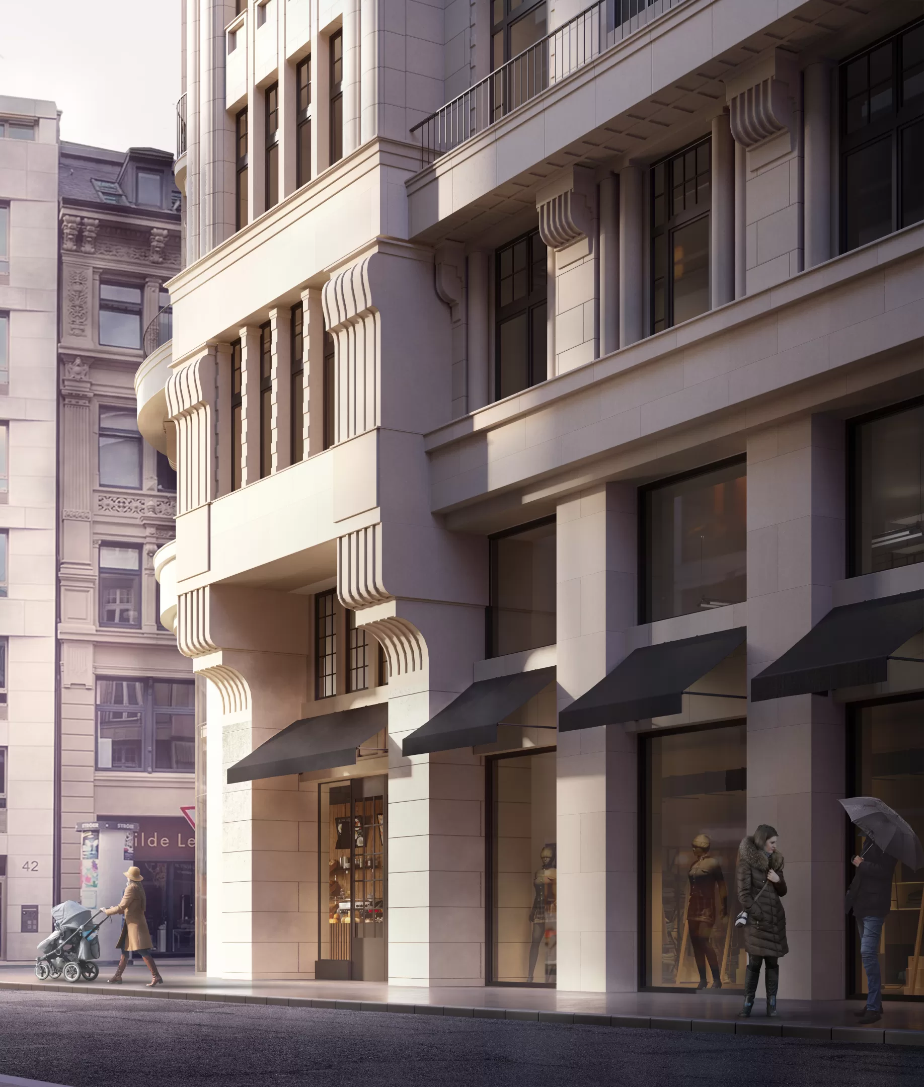
Due to several unfortunate alterations in the past, the Hindenburghaus has lost its firm “grounding”. Horizontal advertising strips and added canopies cut the architectural coherence of the first and second floor. The façade supports on the first floor no longer showed any connection to the structure of the upper floors.
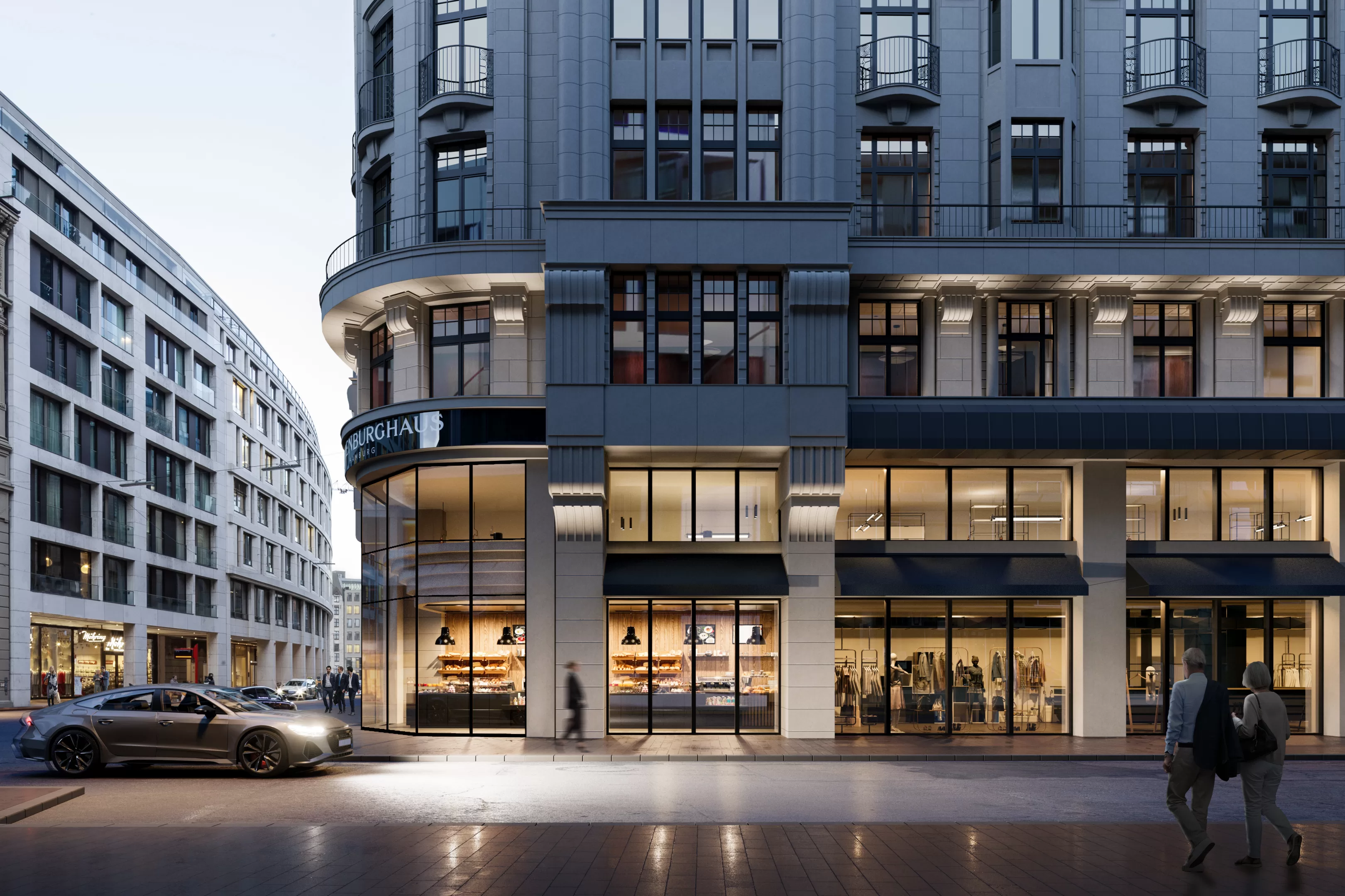
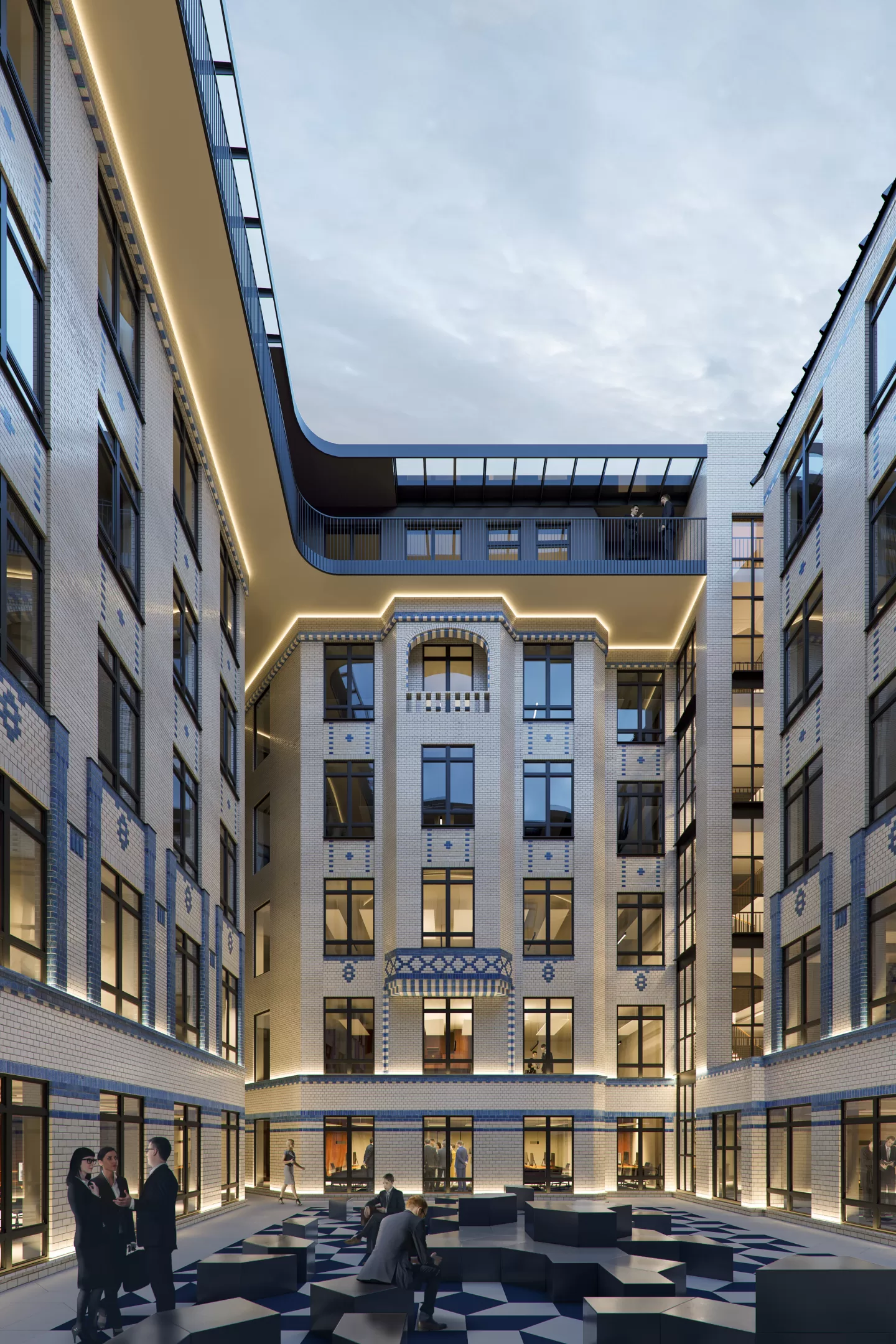
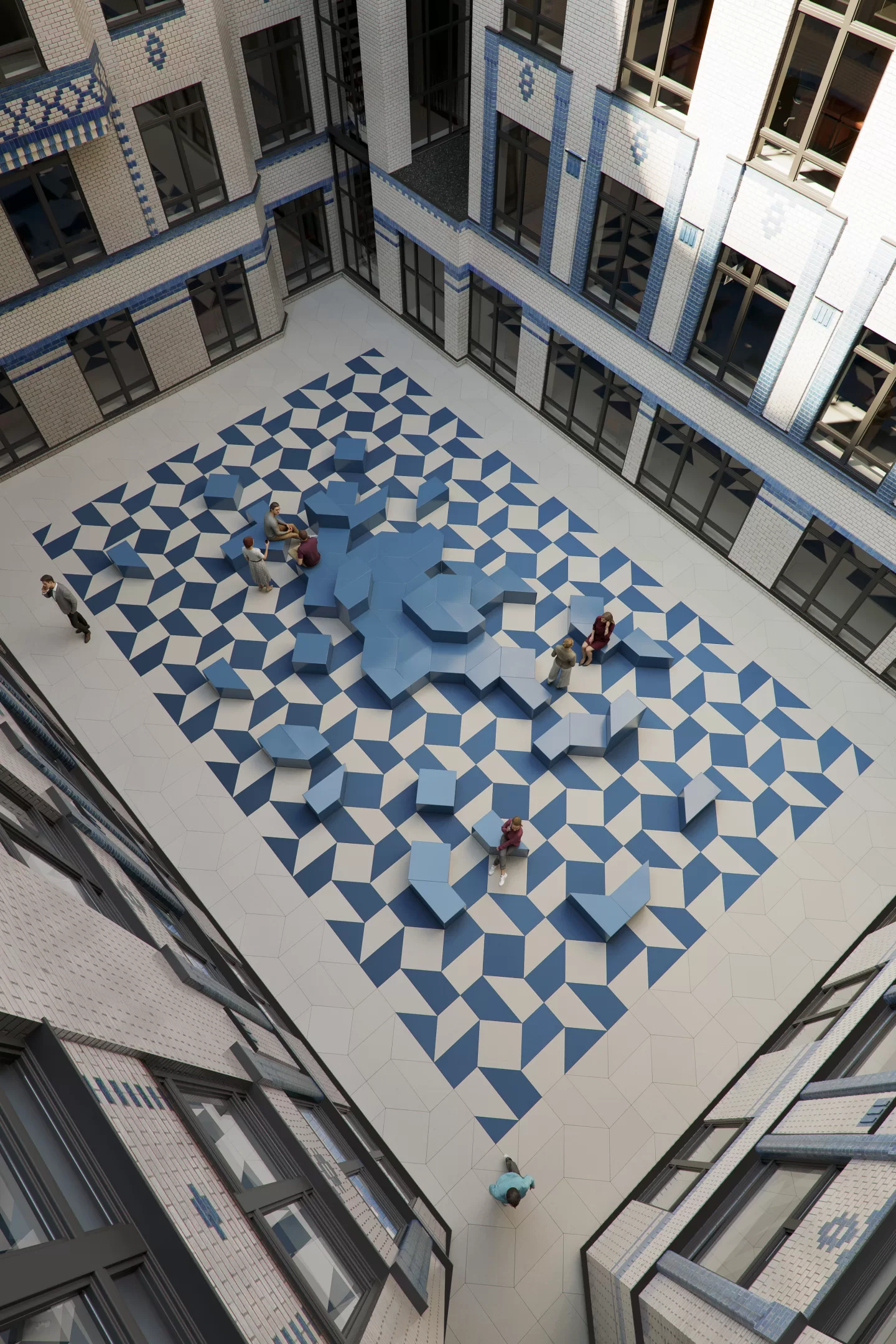
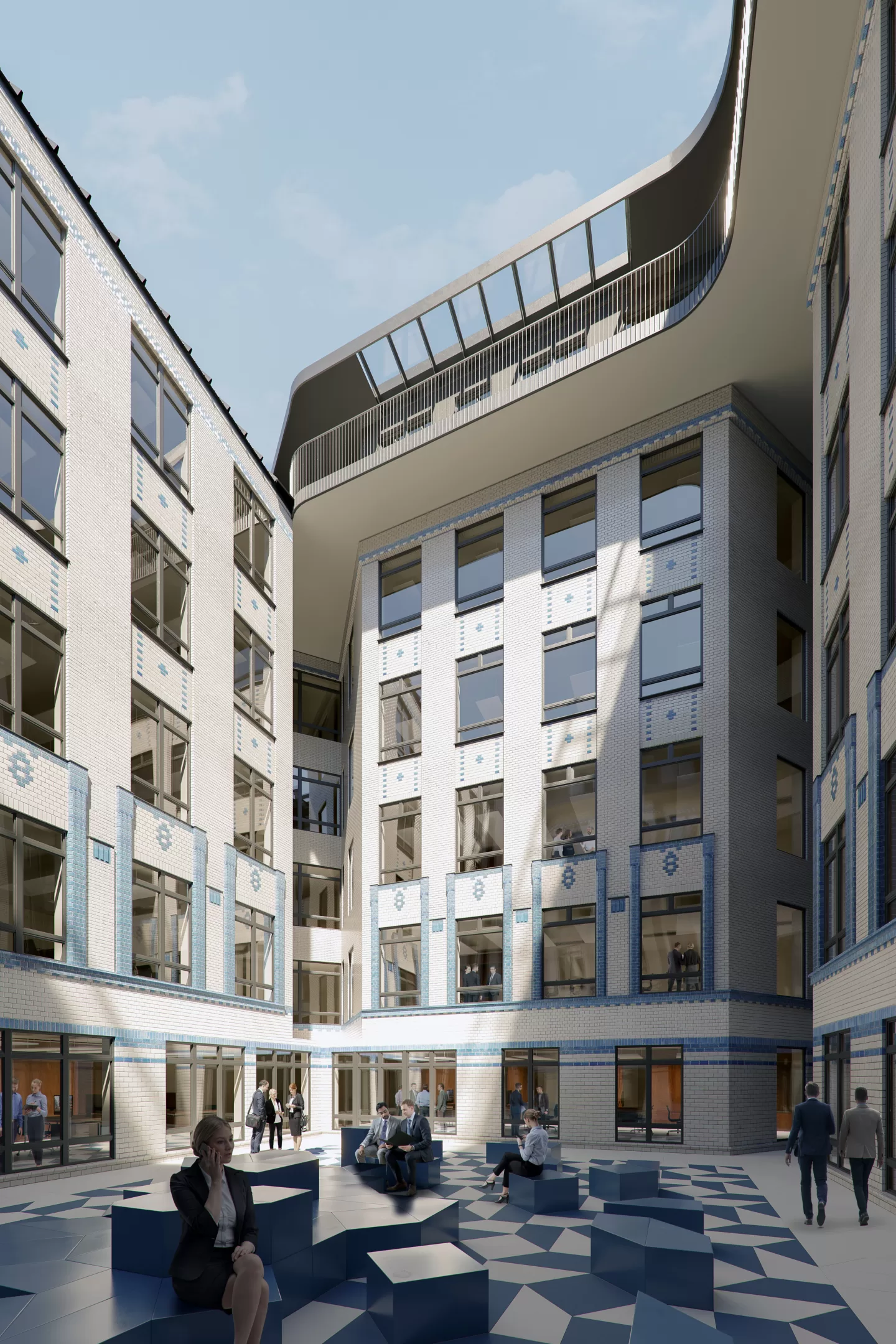
Our design approach puts the building back on a secure footing. By adding façade supports on the lower two floors, it regains a presence that does justice to the claim of such a dignified property. In addition, the glossy round two-story corner, based on the original design of 1909, opens the building towards Großer Burstah. The courtyard will be reactivated as a common area and given a new look. Currently existing arcades from the 1980s will be removed and the historic façade will be restored using the original materials.
Staircase Concept
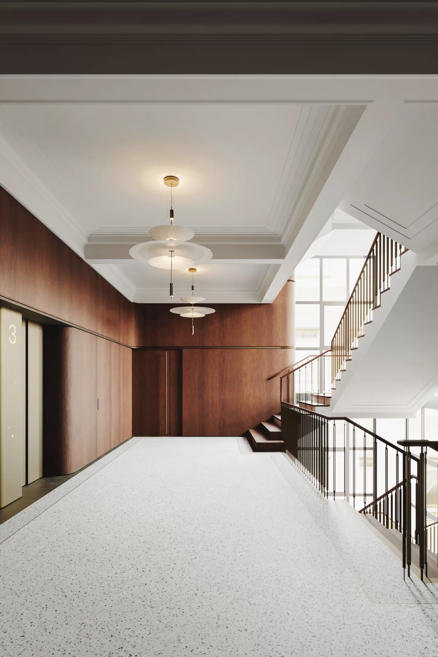
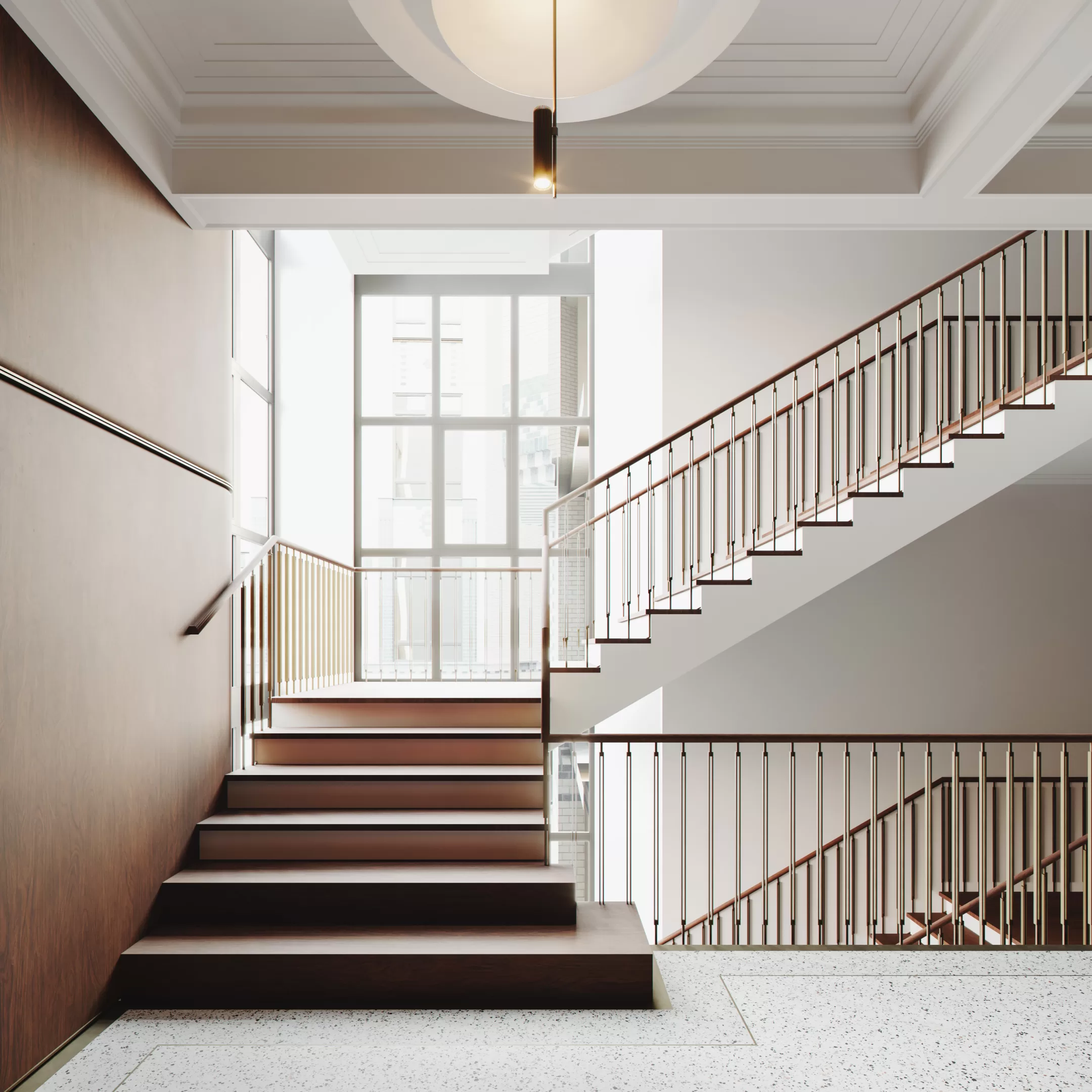
The building gained special fame due to its opulent, noble entrance with the elaborate wood carvings which was supposed to be the entrance to the originally planned use as a hotel. However, the rapid rededication as an office building has led to the staircase from the first floor onwards being much plainer. In addition, it has been renovated over the years.
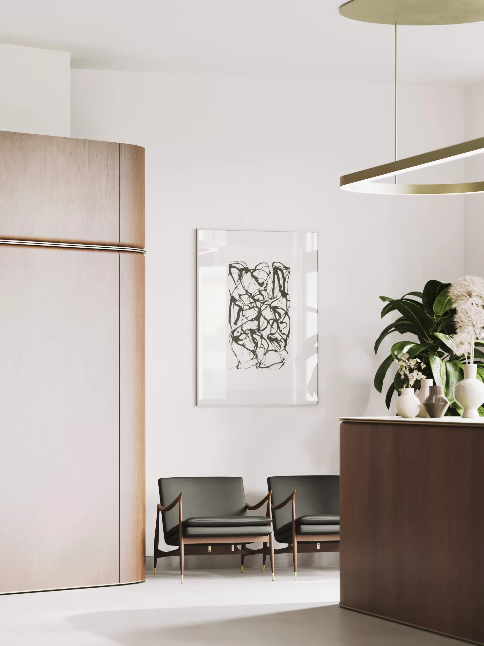
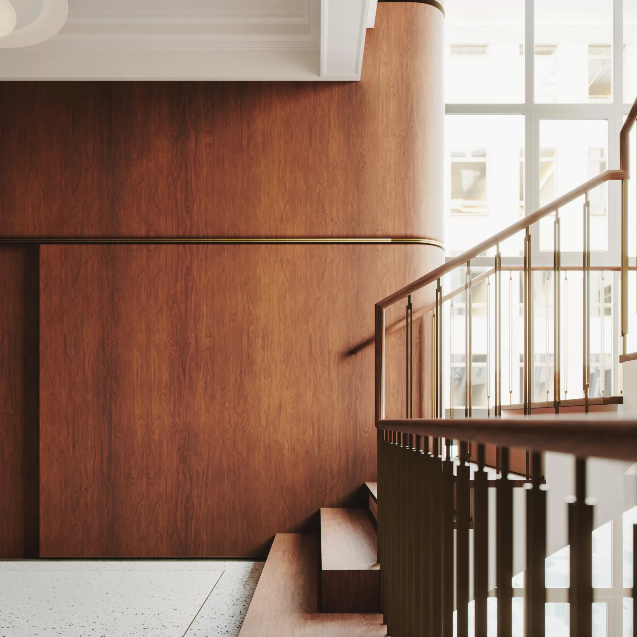
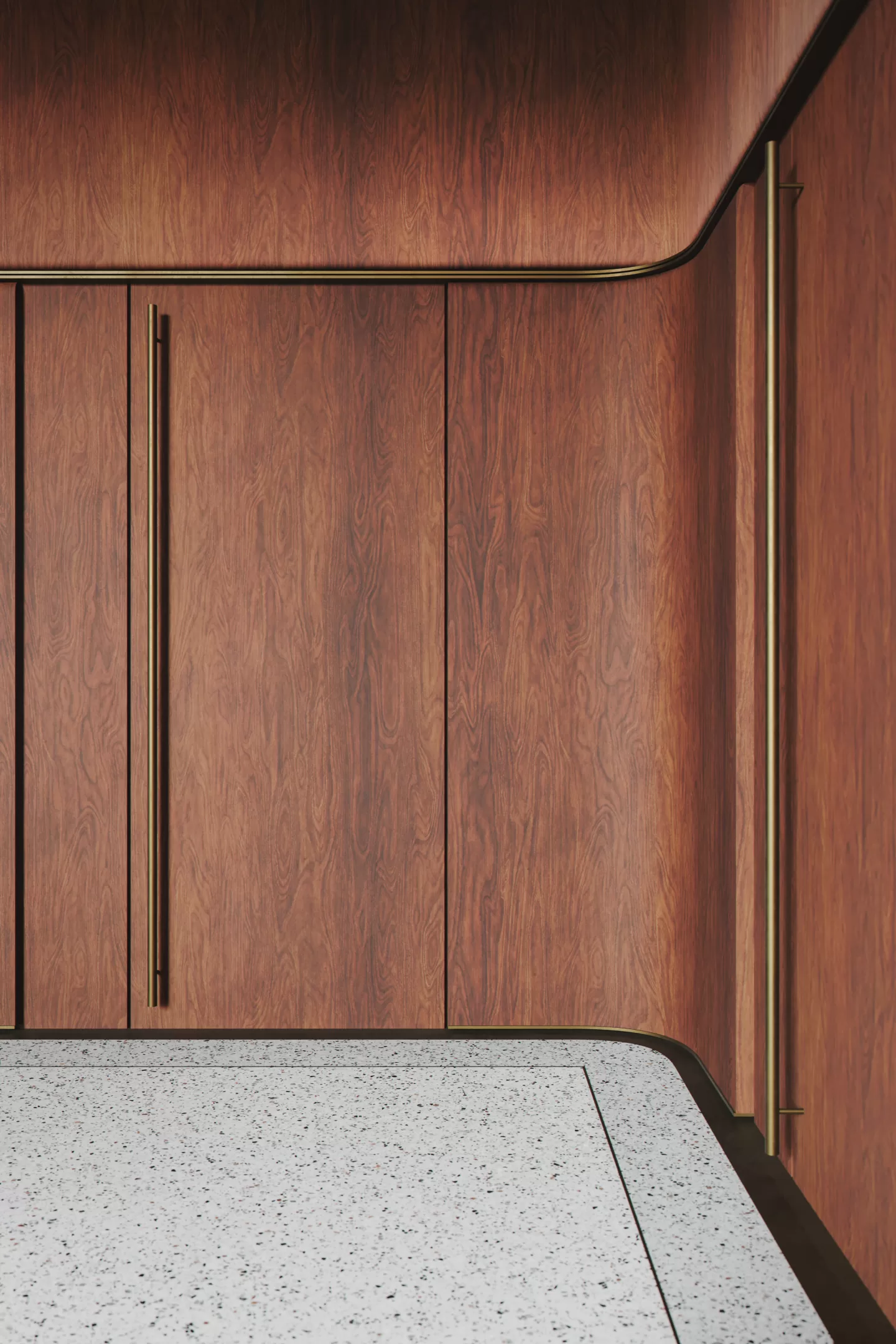
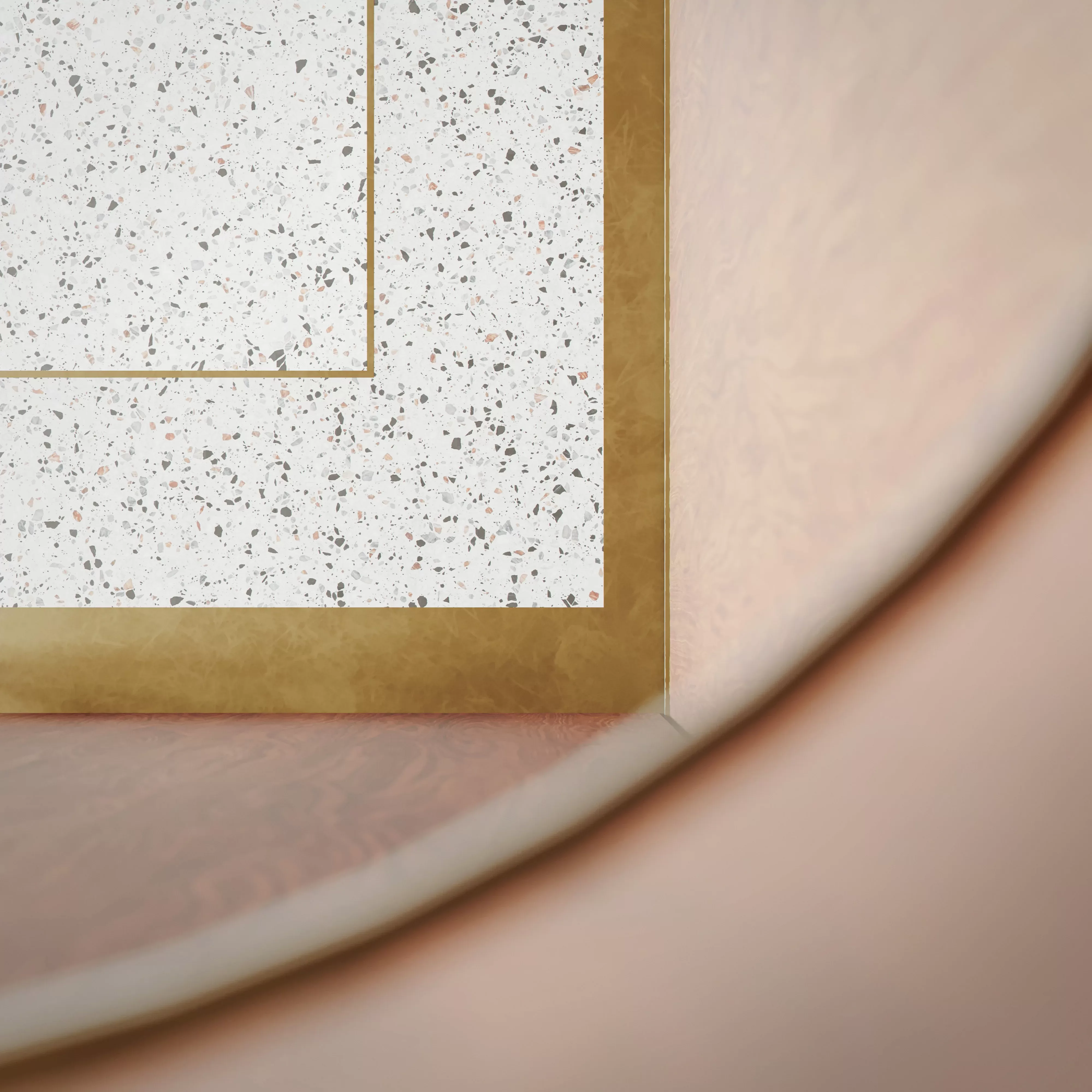
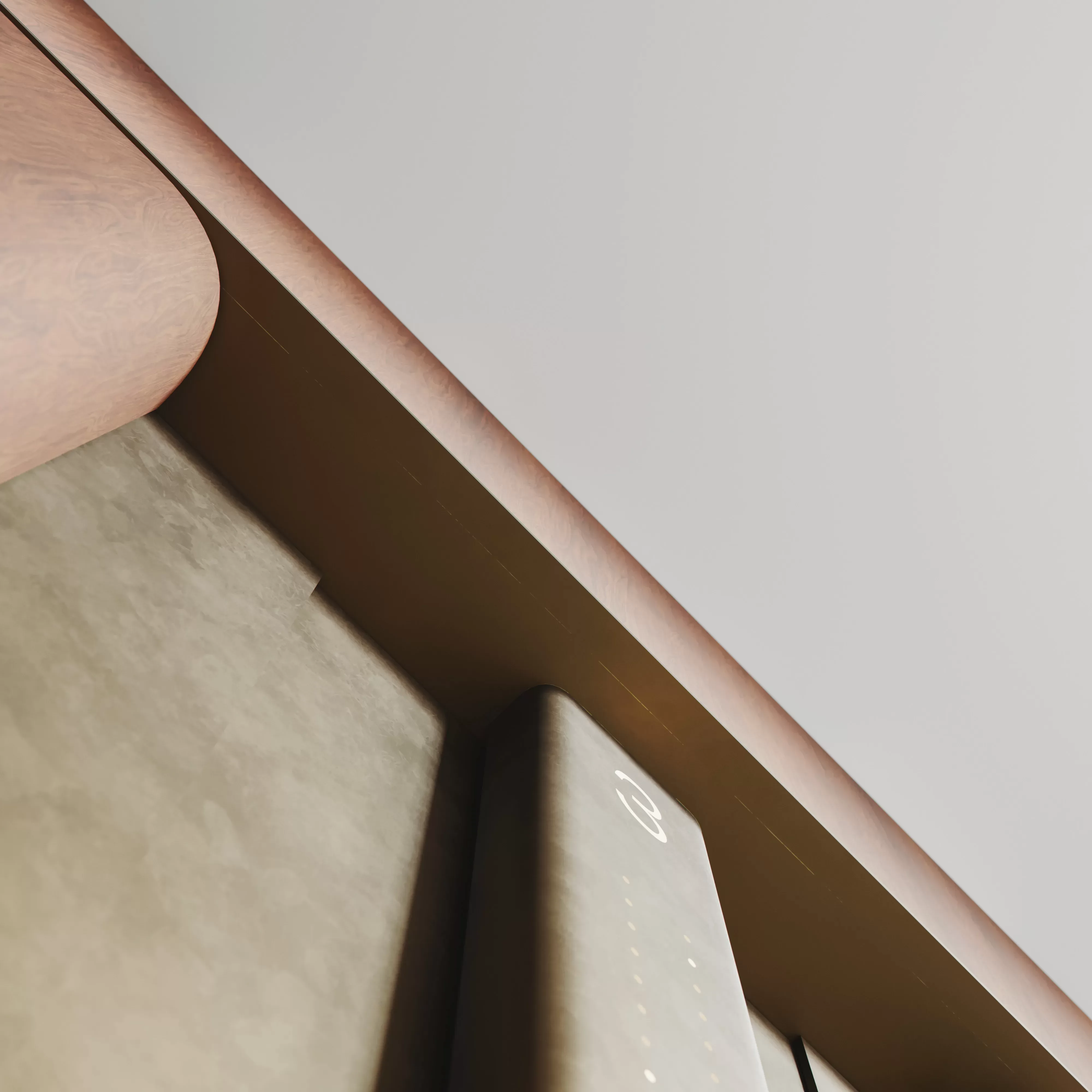
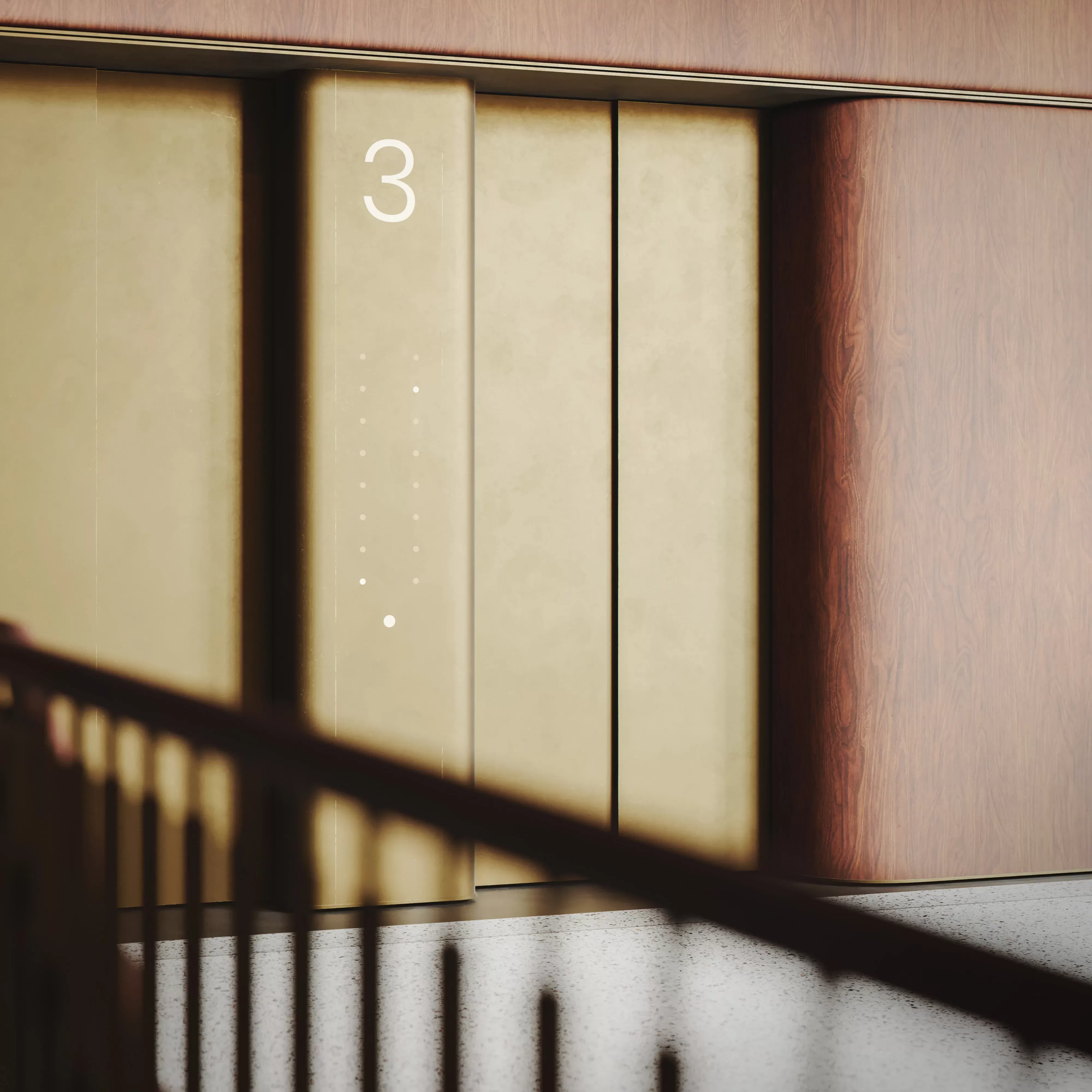
The new design is based on the historic foyer in its choice of materials and formal language, but clearly subordinates itself through its restrained simplicity. Fine, modern detail solutions of wood and bronze recall the gandesse with which the architects Hiller & Kuhlmann proceeded at the beginning of the twentieth century.
Material Study
Office Concept
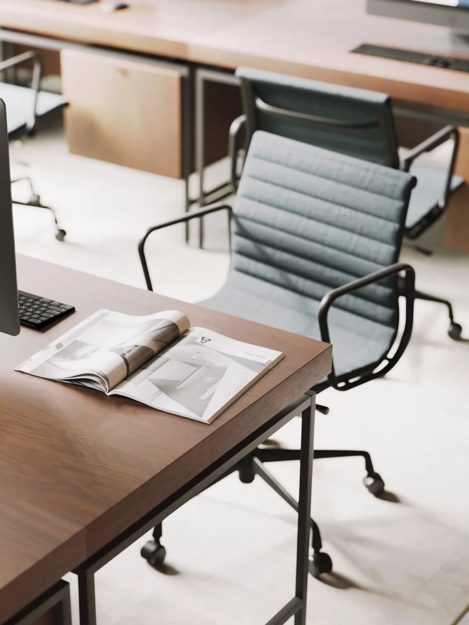
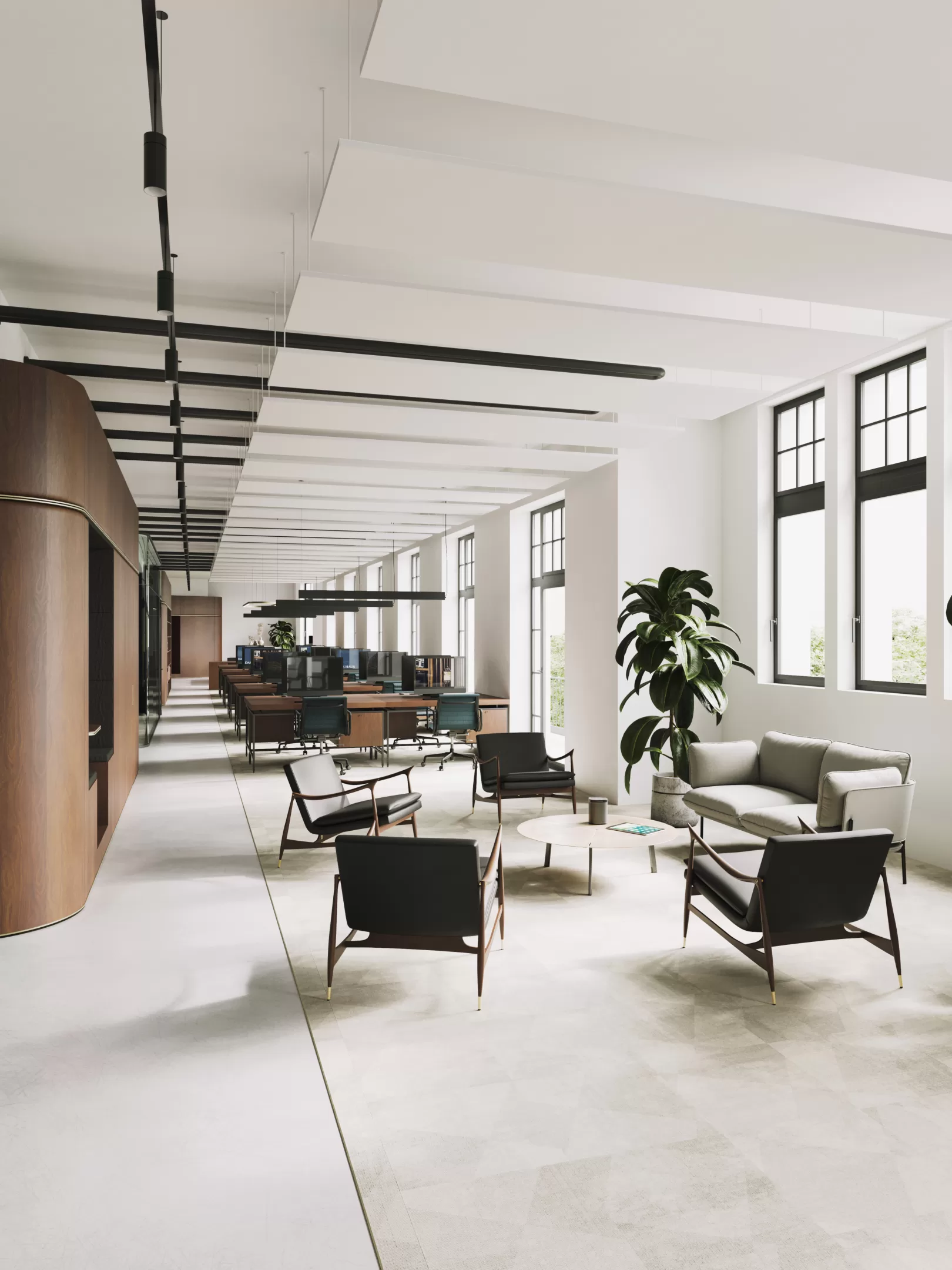
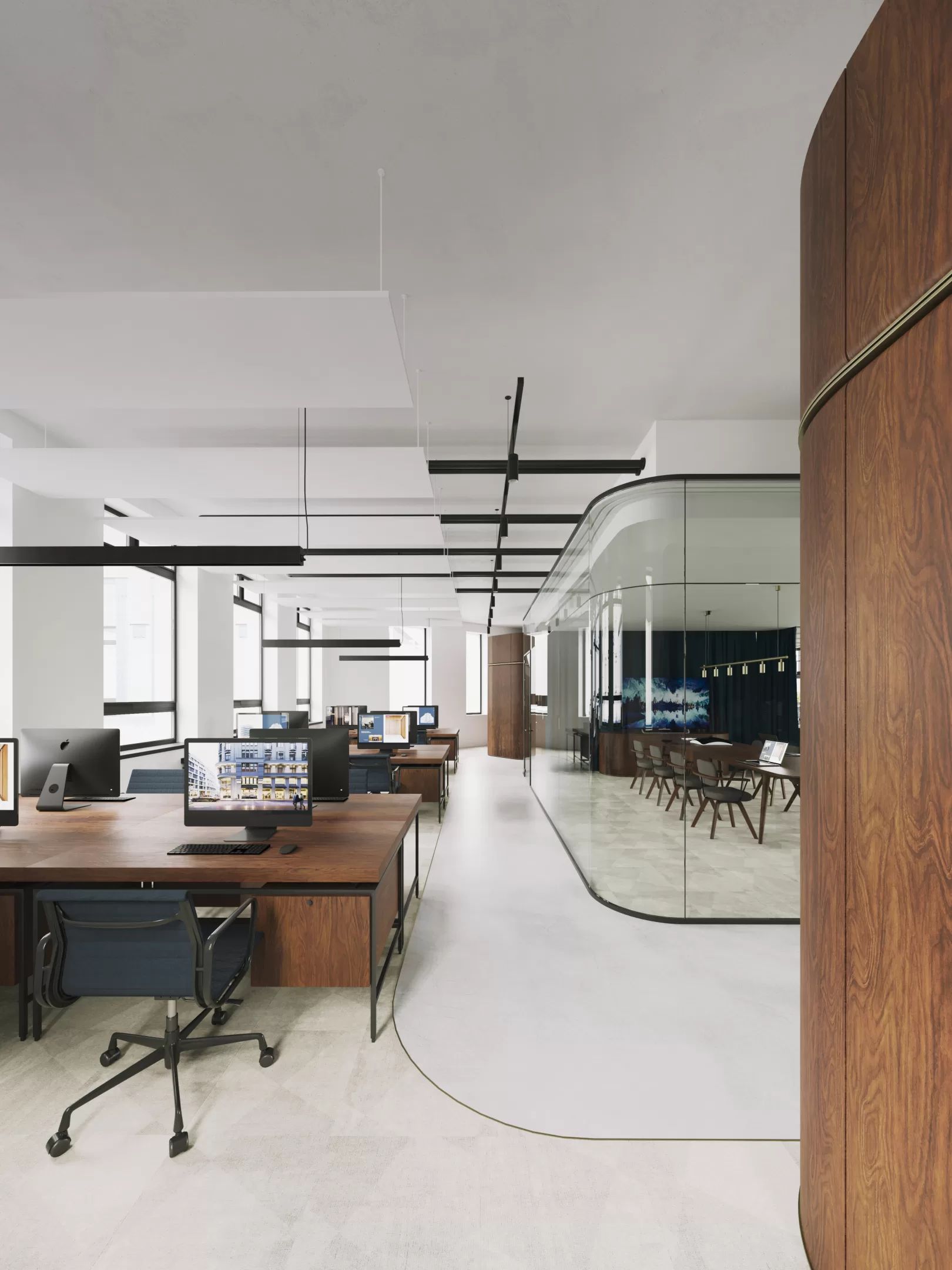
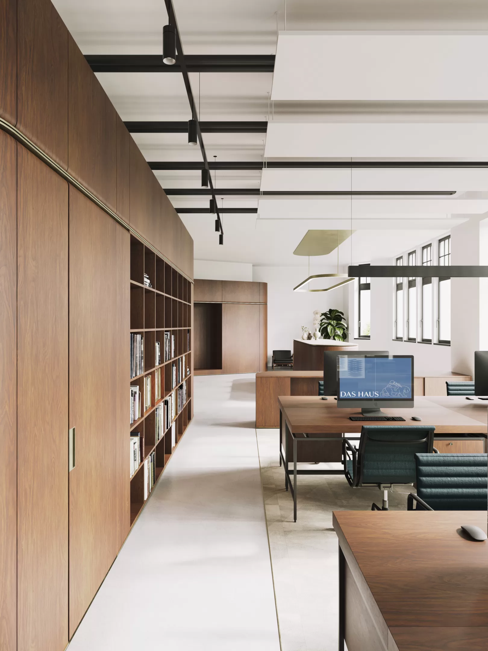
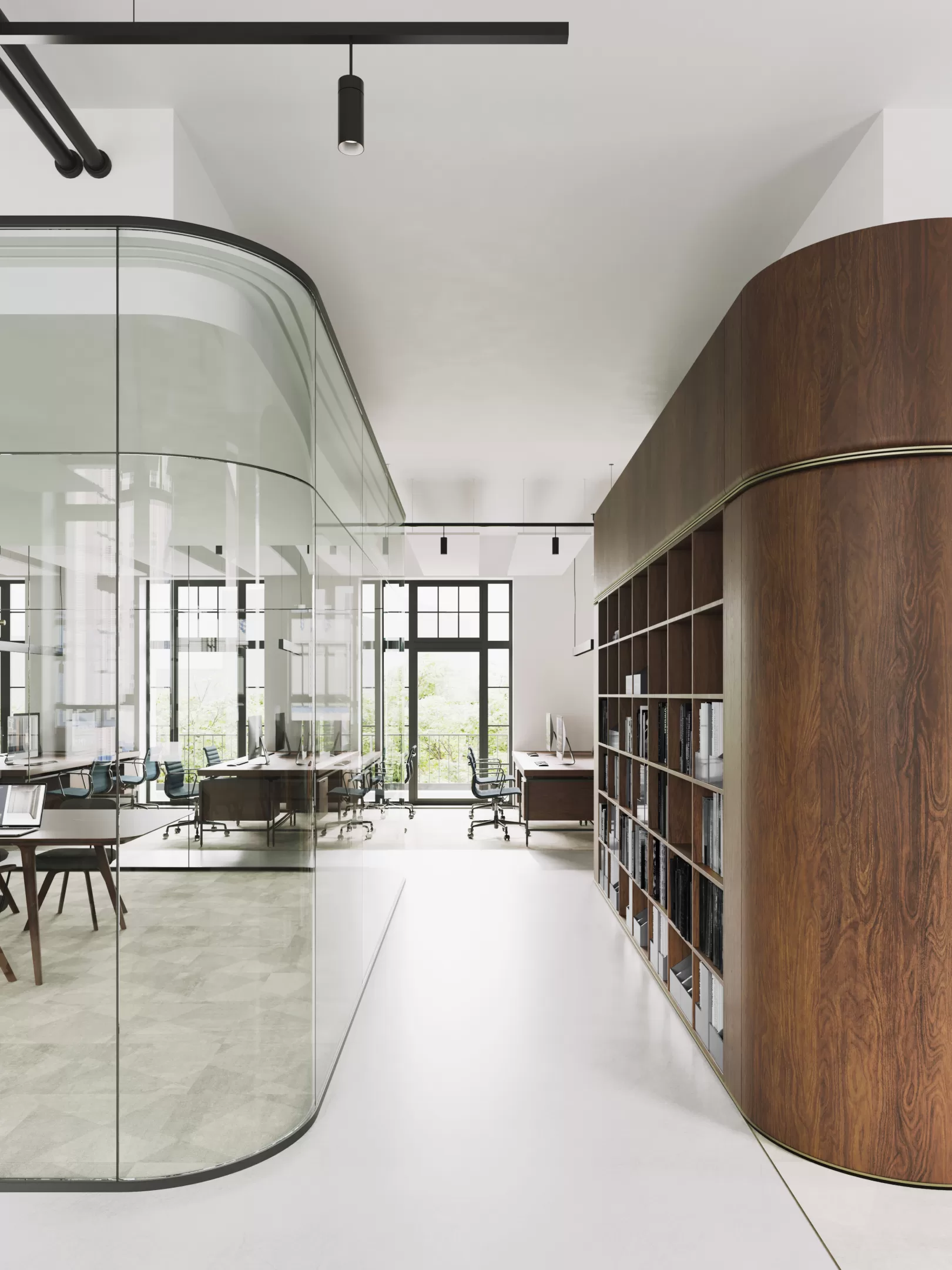
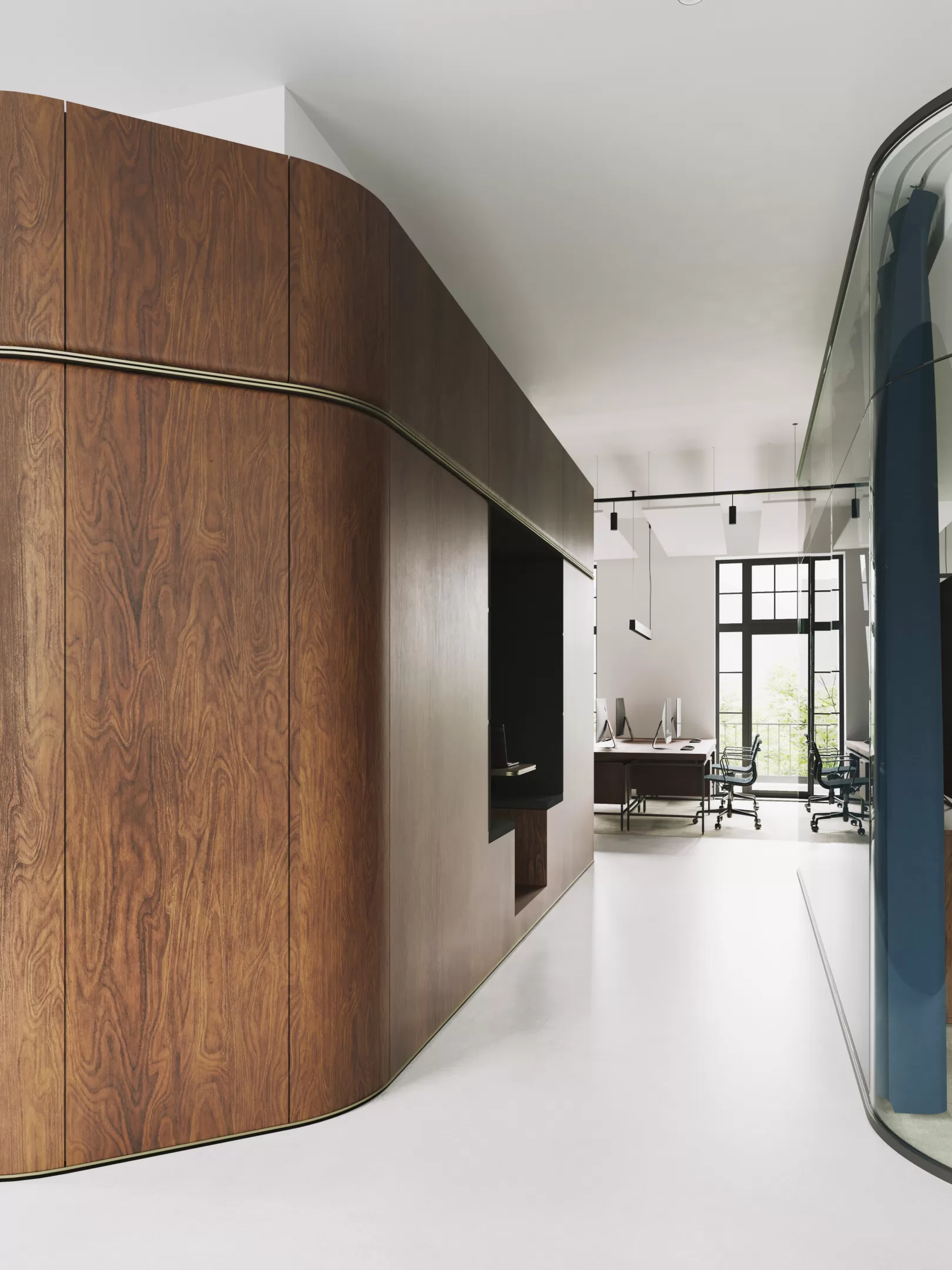
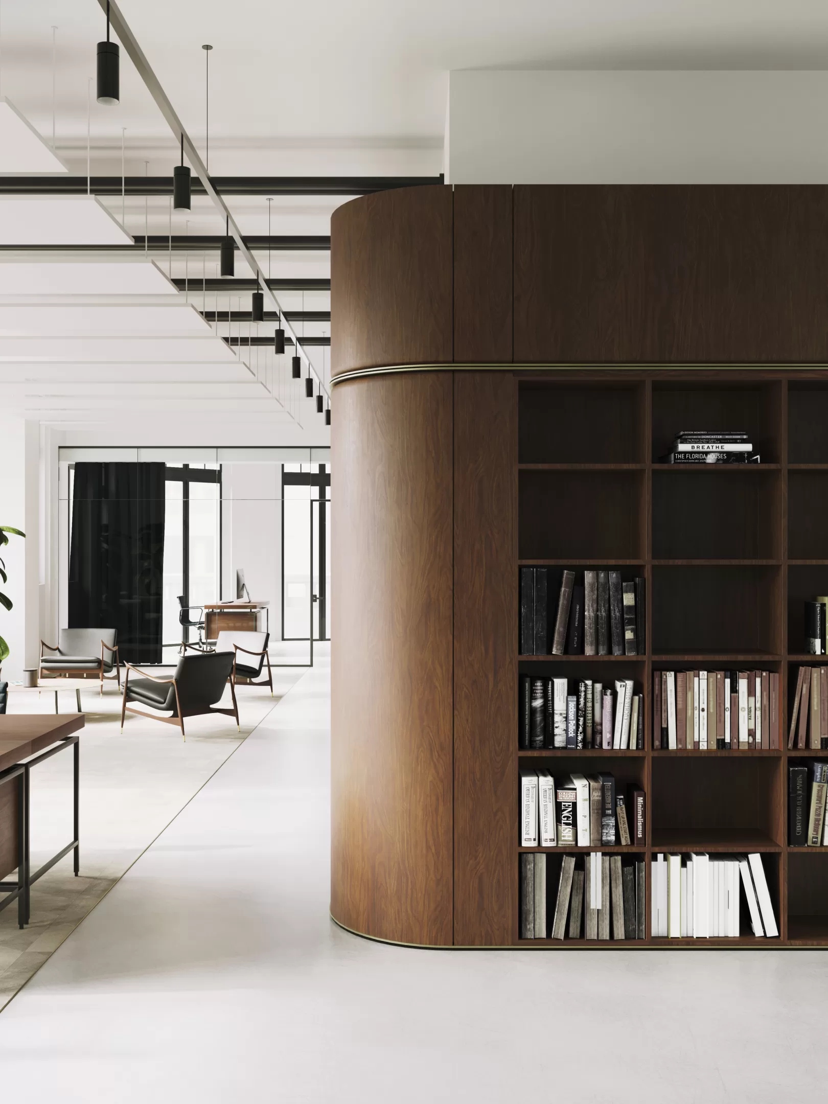
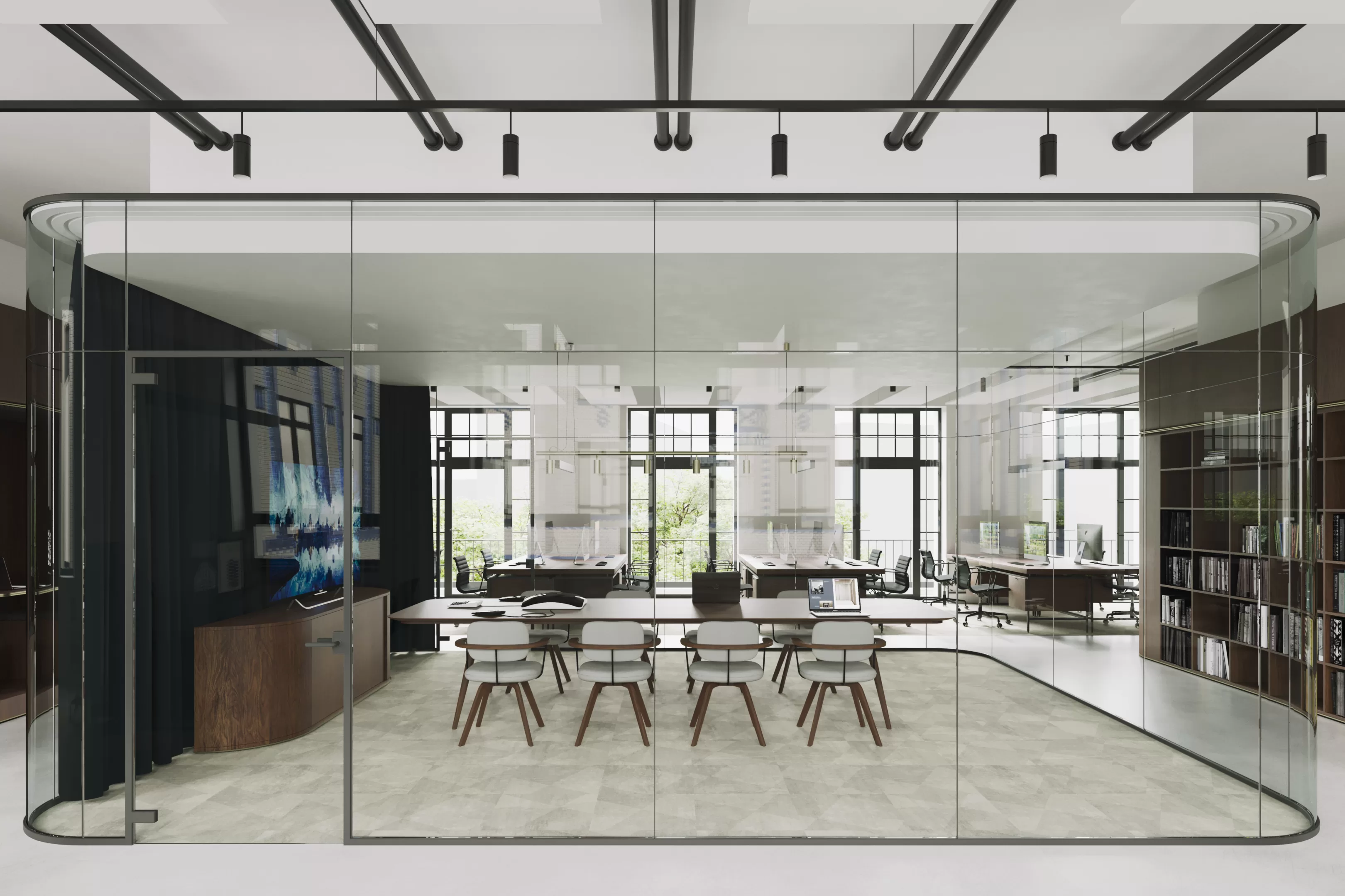
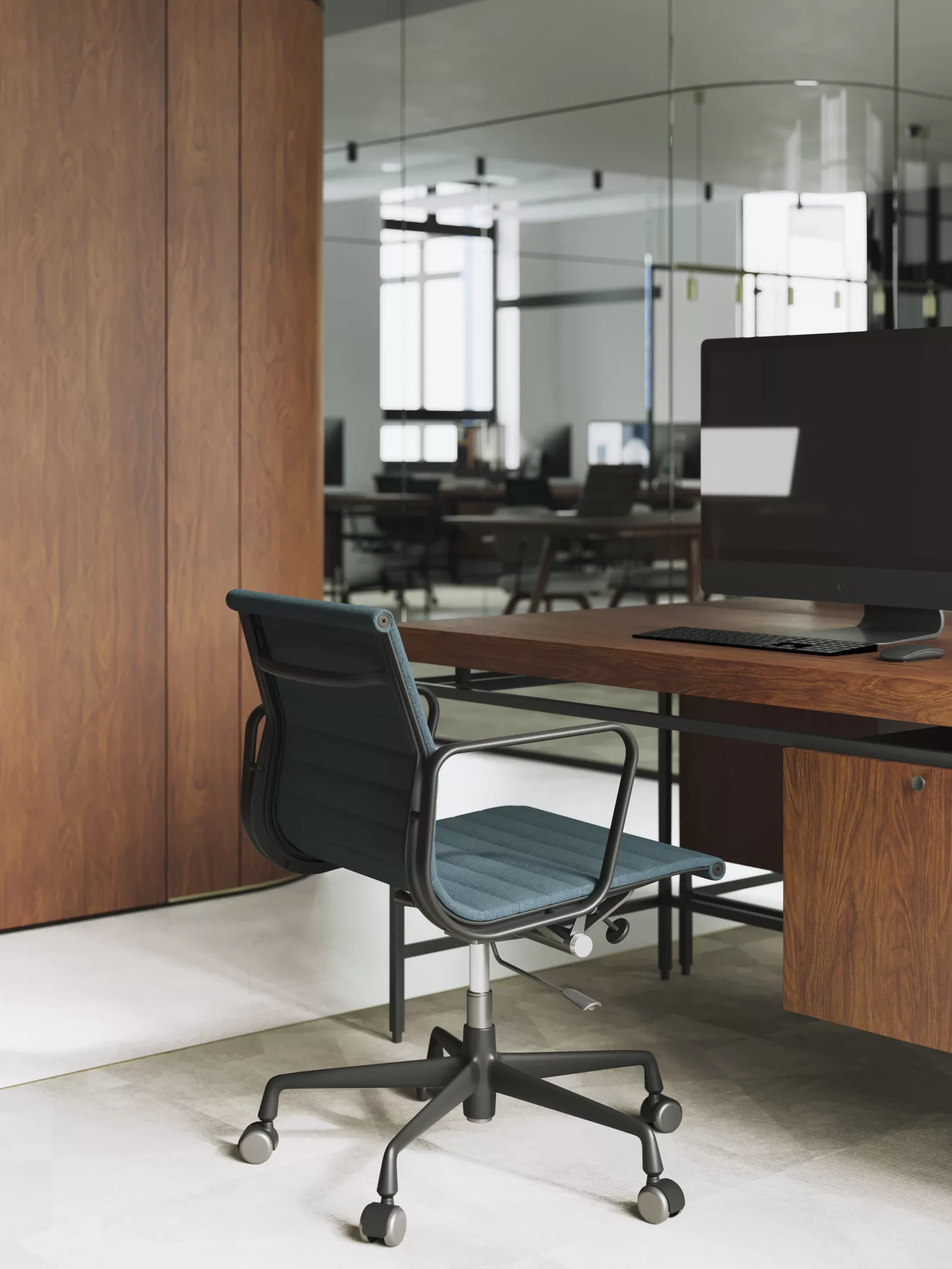
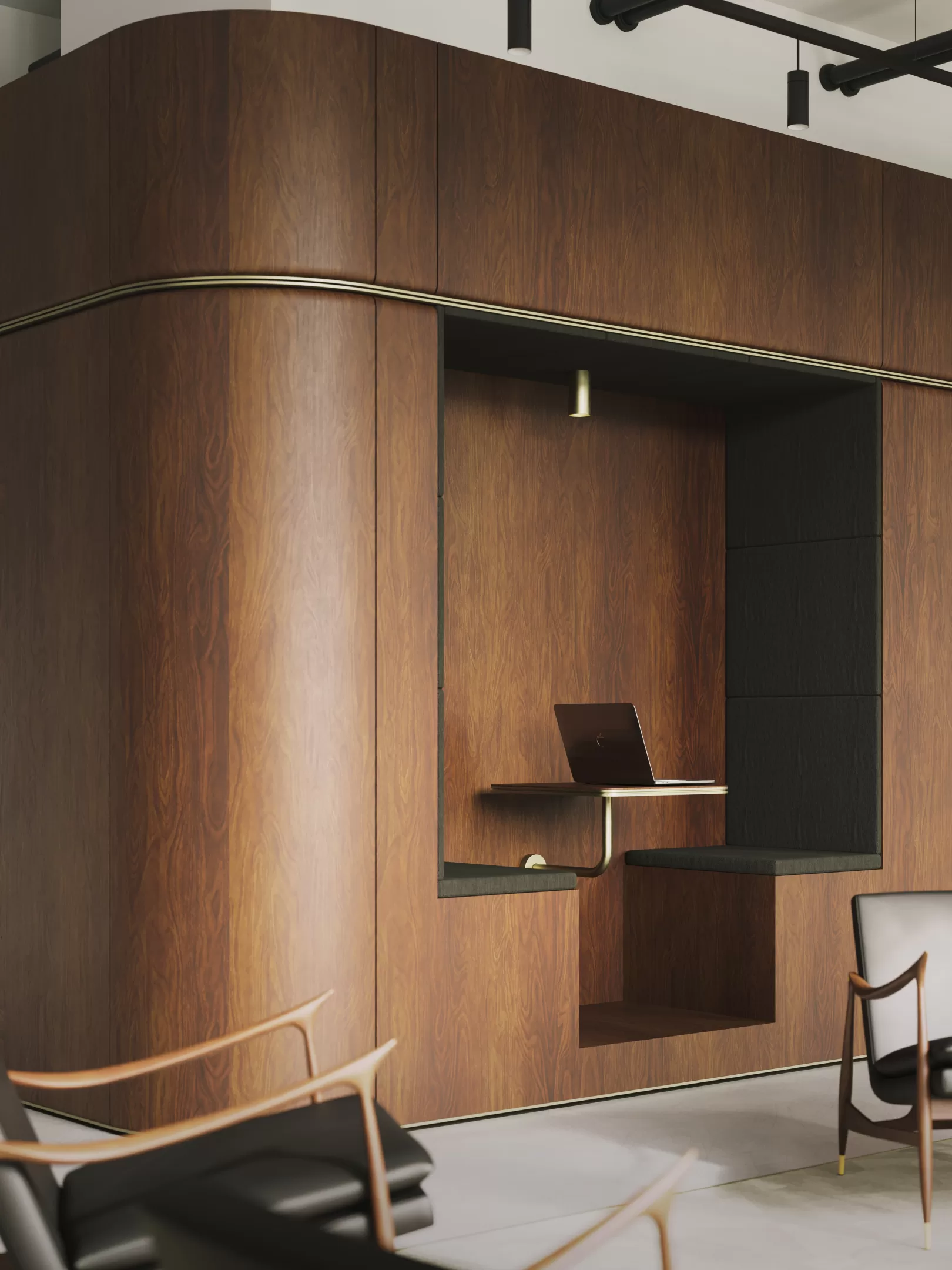
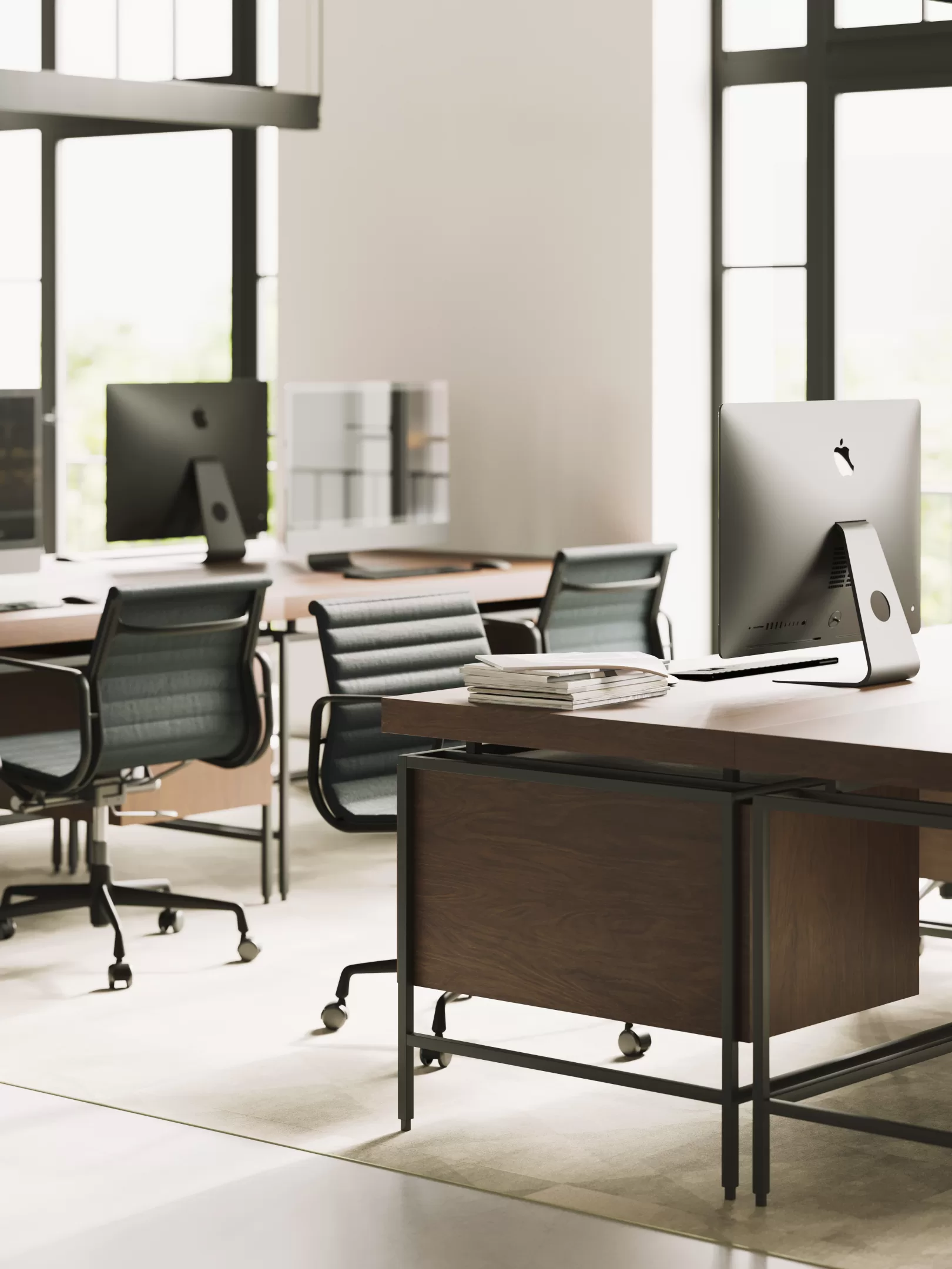
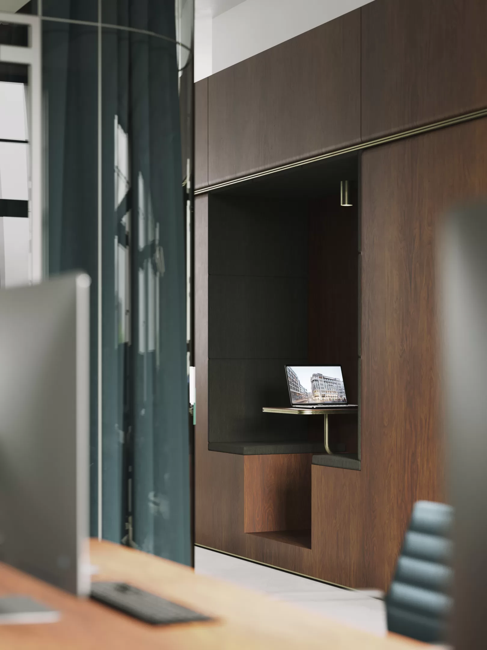
The design of the new office spaces continues the formal and material language of the staircase. Large, open and bright work areas are oriented around the wooden core, which, in addition to the technical supply functions, also includes a kitchenette, toilets, retreats, and a conference room.
